Agents of Shield is a series set in Marvel’s comic universe and ties into their ongoing movie fleet with Avengers at the helm (and soon Avengers 2). If you did not know that, you are seriously missing out – if you are interested in such things. This project features two logos from the series, as well as an attempt to bleach wood that failed. Enjoy, and remember to be Inspired!
A little more Background on Shield (and Hydra)
This projects combines the logos of the franchise’s two main factions – the good guys, known as Shield – or rather S.H.I.E.L.D., which stands for Strategic Homeland Intelligence, Enforcement and Logistics Division. As remarked on the show, someone really wanted their name to spell Shield. Their antagonist, really the bad guys, are called Hydra, which is no abreviation but a motto in itself, promising that there will always be more bad guys – “cut off one head, two will take it’s place”.
On top of that, the history of Hydra and Shield is closely connected, and while I do not want to spoil any major plot points let me just say that mounting these two distinct logos on the same base makes more sense than one would think. Okay, maybe I did spoil a little.
Getting the Template
Obviously I made templates for this, but since these are copyrighted logos I do not know whether I can just make it available like this – although I would like to if I find that it would be okay.
Anyway, what I will do is tell you how I got about making my template. The main reason to do that is to scale it accordingly and save some ink compared to simply printing out some wallpaper downloaded of the internet.
Maybe all I need to do is to add a copyright notice to the template so I can upload it, and maybe I will. If I do, I will let you know. But the main reason for me publishing this how to is that is works for other logos just as well.
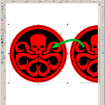
As for the vector image, I downloaded the two logos via the google image search, looking for a reasonably high resolution using the search terms “shield logo” and “hydra logo” respectively. I guess you could call this part pretty staight forward. Still, you could make things a little easier for logos that usually contain several colors to find one that only has two colors in it – black and white works well here.
Saved the image(s) and fire up Inkscape. Then I dragged them into the opened document and told Inkscape that I wanted to link them, not embed them.
Then chose “vectorise bitmap” in the path dropdown menu and fiddle with the settings, clicking on “preview” every now and then until you see the logo porperly. Yes, that does not sound very professional, but it works. For reference, here are the settings I used – you can see them despite the different language.
Click on “OK” and close the dialogue. Drag your image to the side – you will actually catch the vector image. At this point, you can delete the image that was underneath it.
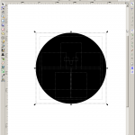
Now mark the resulting vector and ungroup it (shift + ctrl + g) – you get a stack of vector shapes in case you had the image traced in a number of layers, which I did. If not, this step is mute but does not hurt.
Pick up and drag the topmost of those shapes away from the others and delete those. You do not need them. What you are dragging away should already look like the desired logo.
From the “path” menu, select “explode”. This will turn your one vector piece into a collection of shapes that make up the logo. Make sure that you do not move any of the. Best not to unselect them at all.
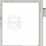
Now select the “colors” dialog as seen below. It should open with the “fill” section already active. Click on the X to remove the fill on those shapes. The logo will disappear, at least kind of, but it is still there, as you should be able to see from the selection rectangles.That is mainly due to the fact that the shapes now have neither fill nor stroke.
Then select “stroke” and click on the solid rectangle, which means that it should use a color for the stroke – black by default. Now you should have the logo’s outlines visible, and the template is almost done.
Now all that is left to do now is to size the template to your liking. You can fit it onto one page like I did or make it larger, but if you want to make a larger version you should export your template as an image (png or jpg) and then use Bigprint by Matthias Wandel to blow it up to the size you want.


Adjusting the scale – I wanted the Shield logo to have a ring around, but the Hydra logo should go without.
I hope this little write-up helps you to create any templates you might need. If you have questions feel free to ask!
All those Variations
As always there are a number of ways to achieve this result. For cutting out the shapes a scrollsaw is the best alternative to the bandsaw, possibly followed by the coping saw. A jigsaw might work, but specially with the hydra logo you would probably be hard pressed to hit the shapes – and not the fingers trying to hold the piece.
The sanding, as usual, can be accomplished with various power sanders as well as using hand sanding. Some pieces are less accessible to certain power tools than others, so use whichever method works best.
As for the materials, due to the nature of the project – no real structural stresses and no dependencies on thickness – you can use anything you have on hand. Using boards gives you options with the grain, but using melamin or even OSB and painting it will work just as well.
On that note, you can replace the more rustic rust-solution technique easily, either by painting or by simply picking different species of wood. Making, say, the Hydra logo from walnut would have achieves pretty much the same effect as the rust did, maybe even better depending on the piece of walnut. Or use a severely figured wood and alternate the grain direction to make the logos pop.
Thanks for reading/watching, and remember to be Inspired!
Inspire your inbox!
Subscribe and never miss a project!
Thank you for subscribing!
Something went wrong...
We respect your privacy and take protecting it seriously!


